El Confidencial's login and signup lived in two separate modals — confusing for the user, who had to decide which one they wanted before even typing their email. I redesigned them as one email‑first component reusable across the entire product — a single screen with four ways in, where the system reads the email and branches between login and signup for the user. Two years on, the component is wired into 24+ surfaces, serves 25.2M appearances every 90 days, and 47.89% of users who interact with the CTA end up inside.
Two separate modals — one for signup, one for login — forced the user to decide which one they wanted before they had even entered their email. On top of that, the component was wrapped in an iframe that limited where the flow could live: every new entry point in the product needed its own implementation. The redesign had to do three things: unify the flow, take the login-vs-signup decision off the user, and ship one component that could plug into any surface of the product.
I audited the old flow's analytics baseline and benchmarked authentication patterns from international news platforms. Three findings drove the redesign: native email signup had a 31.7% error rate at the GDPR step (the alias was the blocker), login already worked better than signup (22.1% vs 5.9% conversion), and Google was already the dominant entry method even in the old flow. If the redesign was going to bet on something, it had to be social-first — not email.
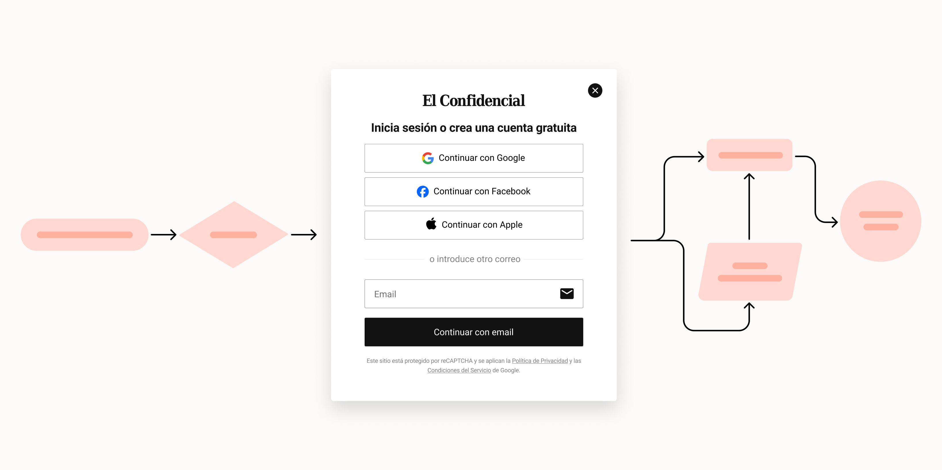
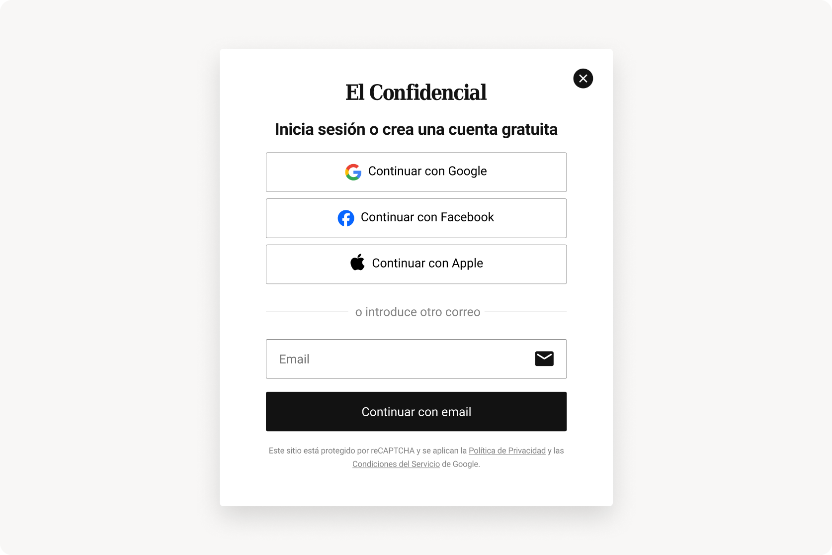
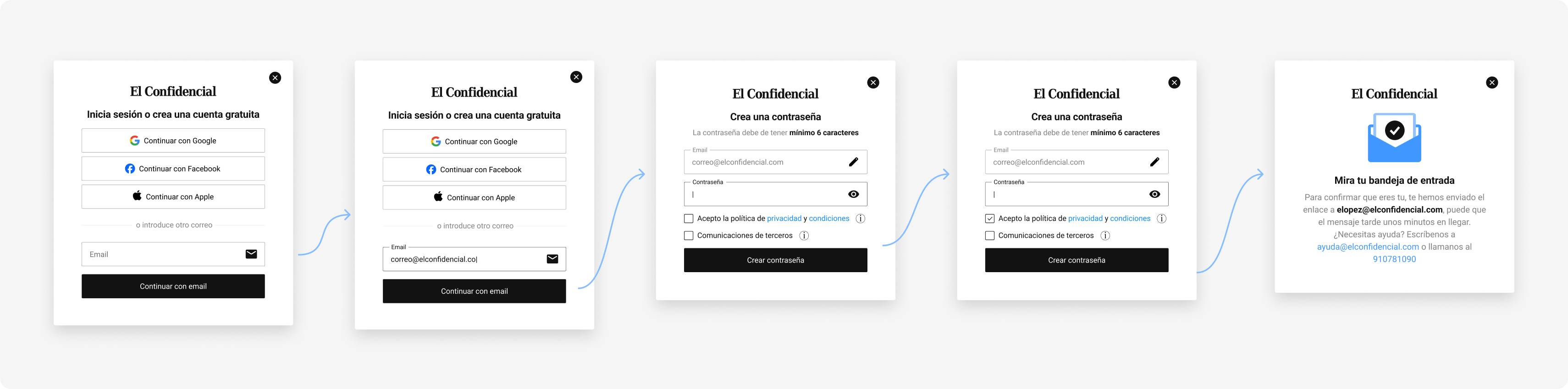
The redesigned modal has one headline ("Log in or create a free account") and four ways in: Google, Apple, Facebook, and email. The user no longer has to declare intent — the system figures it out once it sees the email. Same component, same visual language, used across web (desktop + mobile) and the native apps. No more parallel screens drifting apart with every release.
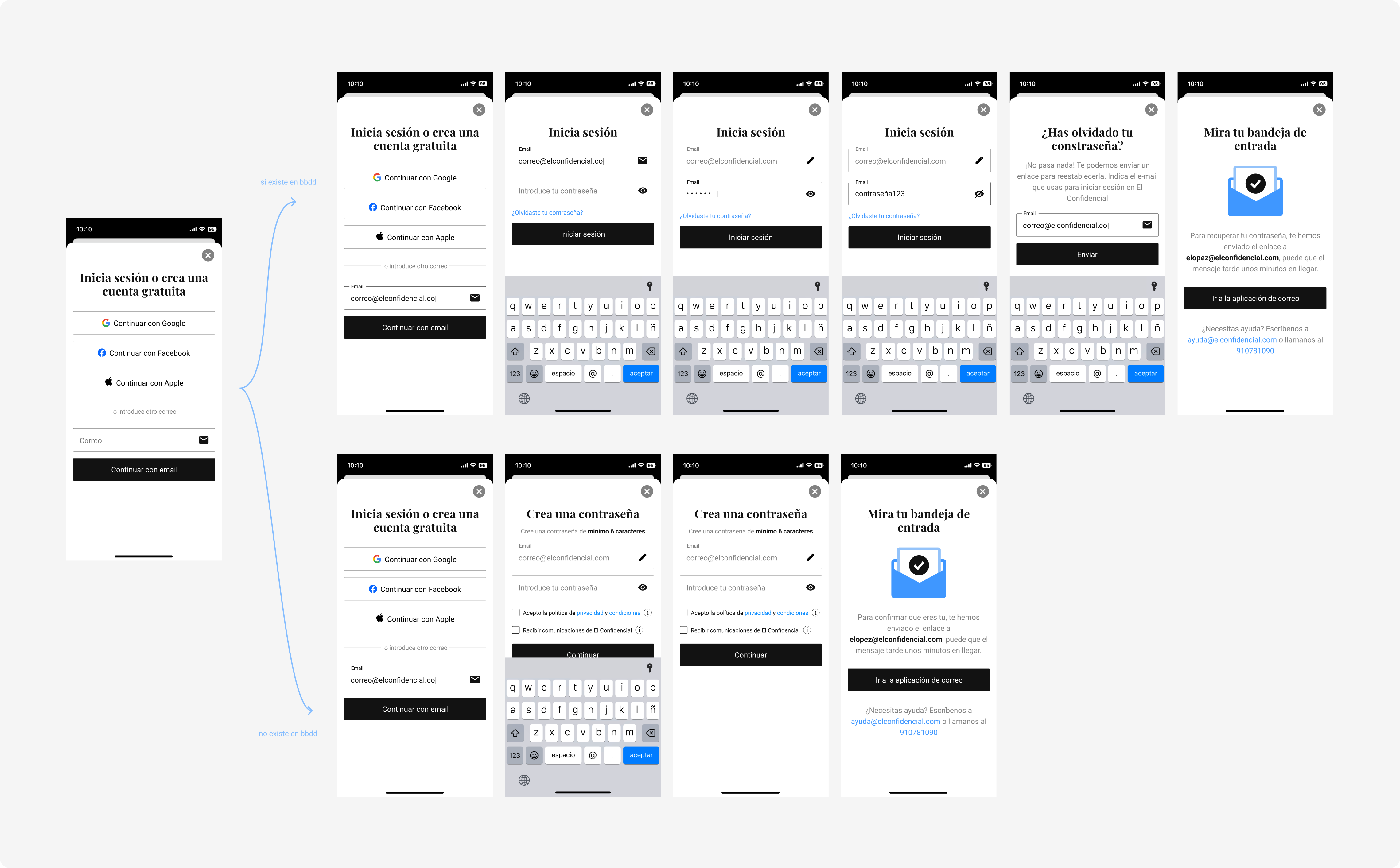
Once the user enters their email, the system checks if it exists. If it does, the modal becomes a login screen — with the email pre‑filled, an edit pencil, and a password field. If it doesn't, it becomes a registration screen — same pre‑filled email, with a "create password" field instead. From the user's side, it's one continuous flow.
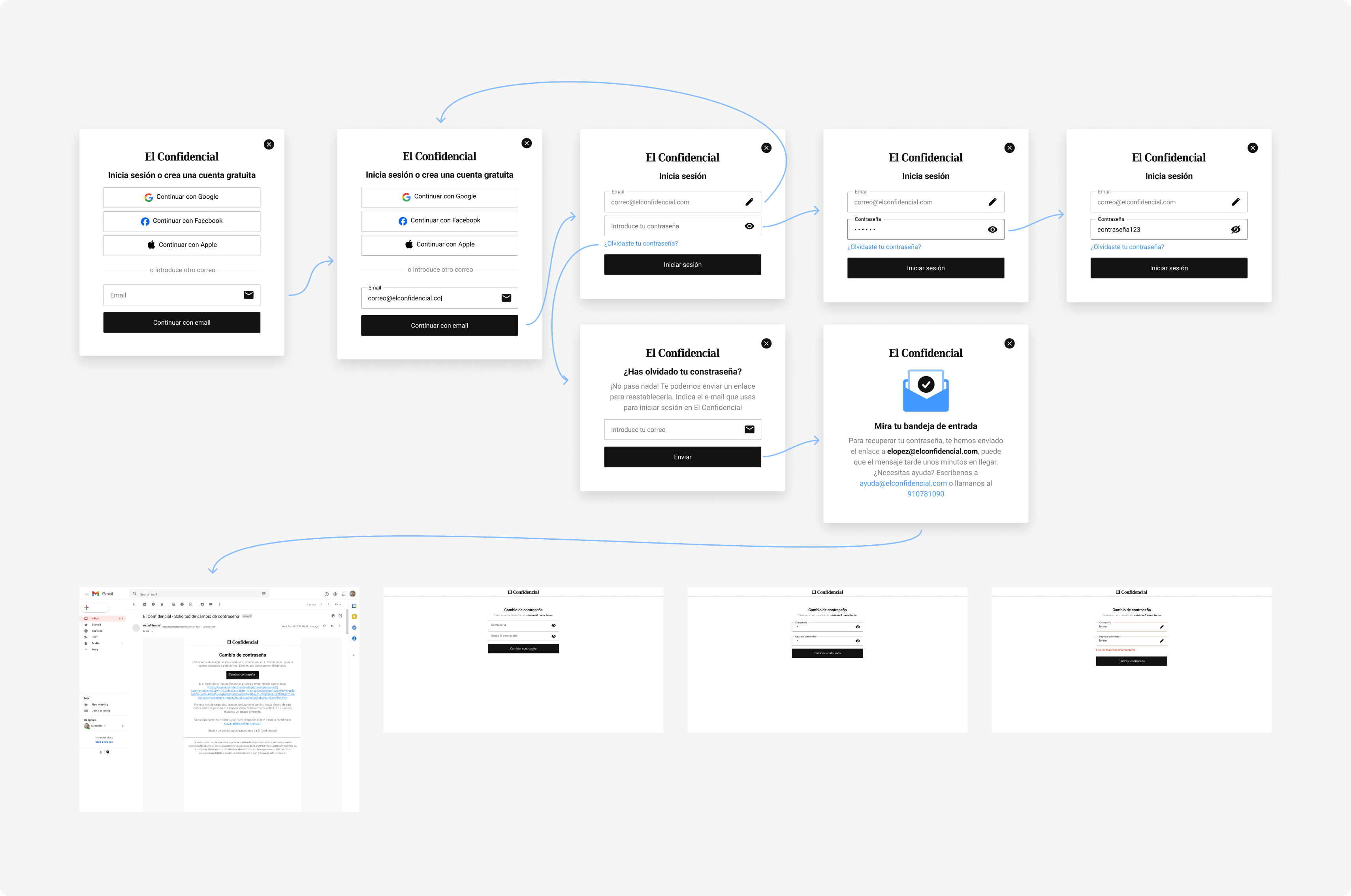
When the email is new, the modal flips into registration without leaving the surface. Email pre‑filled, password field, consent inline, optional opt‑in for partners — all in the same visual language as login. The two flows that used to require two separate modals now share everything except the password behaviour, and the user can't tell where one ends and the other starts.
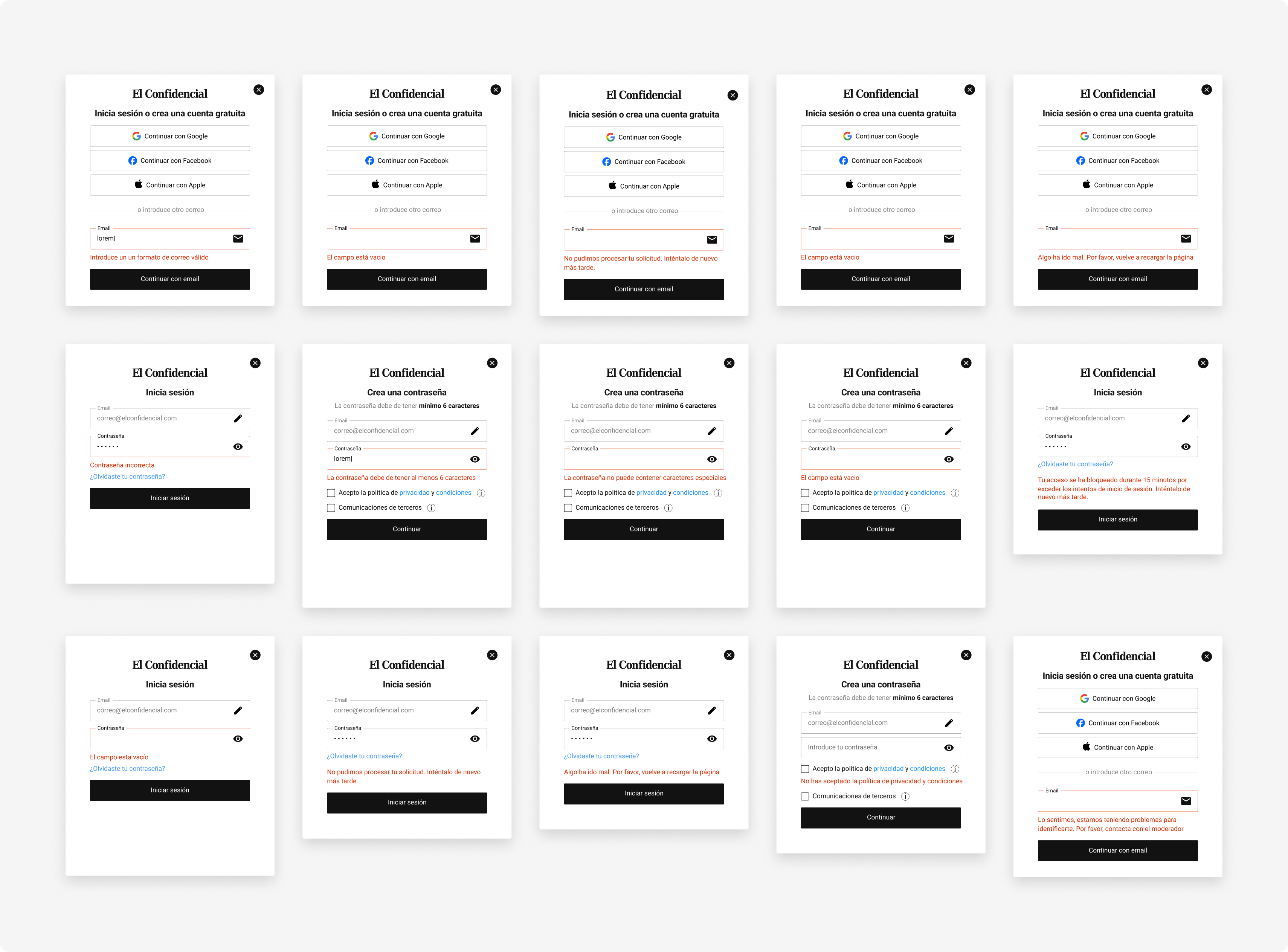
Every error in the unified flow is typed and instrumented. The full error set was defined during the design sprint, before development — so the data team could read which type of error was hitting users from day one, and copy could be tuned per error without rewriting the flow.
Same component, four platforms. The web version was built without iframes — as a custom element that can plug into any surface. The iOS and Android apps follow the same component structure, adapted to each platform's native specifications. One source of truth for design, analytics, and copy across desktop, mobile web, iOS, and Android.
Numbers pulled from production across every surface where the component appears. Two years after launch, the component is still the most active piece of the product and the design decisions still hold up.
Five decisions that defined the redesign. The first is the architectural one — everything else follows from it.
The component is still the front door of the product. Two years of iterations on top and the numbers keep holding: 1,000–2,000 successful logins per day with no dips, 25M appearances every 90 days, the social hierarchy validated by the data is still the visual hierarchy. Every new acquisition lever the team launches — sticky bar, inline registration wall, interest banner — plugs into the component without asking design for another iteration. That's the strongest proof that the architectural decision worked.
Two separate modals would have been faster in sprint 1. But by sprint 24, every new acquisition lever would have demanded its own redesign. One component + system‑driven bifurcation is the reason six different surfaces have been built on top in two years without touching the original spec.
Asking "login or signup?" before the user had even entered their email was friction the system had invented. Once the system took that decision over, the flow got simpler visually and in code. The rule generalises: whenever design asks the user something the system can deduce, it's asking for extra work.