I redesigned El Confidencial's native app paywall as one reusable component used across every flow where subscription matters — from Premium articles to comments to newsletter signups. The goal was twofold: lift conversion and give the company a paywall easier to maintain and operate. Two years on, the annual subscription (set as default) runs 72%/28% over monthly, and the expandable tabs are used by 27% of landing visitors.
The app paywall had two compounding problems. For the user, four separate screens with no shared grammar, drifting apart with every release. For the company, no reliable way to compare plans or measure each flow — months had gone by without clean numbers. The goal wasn't just to redesign one surface: it was to lift conversion and hand the company a paywall easier to maintain, measure and operate.
The paywall is the same wherever it shows up — same plans, same savings badge, same CTA, same expandable sections. What changes is the flow. When the user runs into a Premium article, signs up for a paid newsletter, or comments, the paywall lands as a modal over the content. When the user taps "Subscribe" or arrives intentionally, the paywall takes the screen as a landing. One component, every flow.
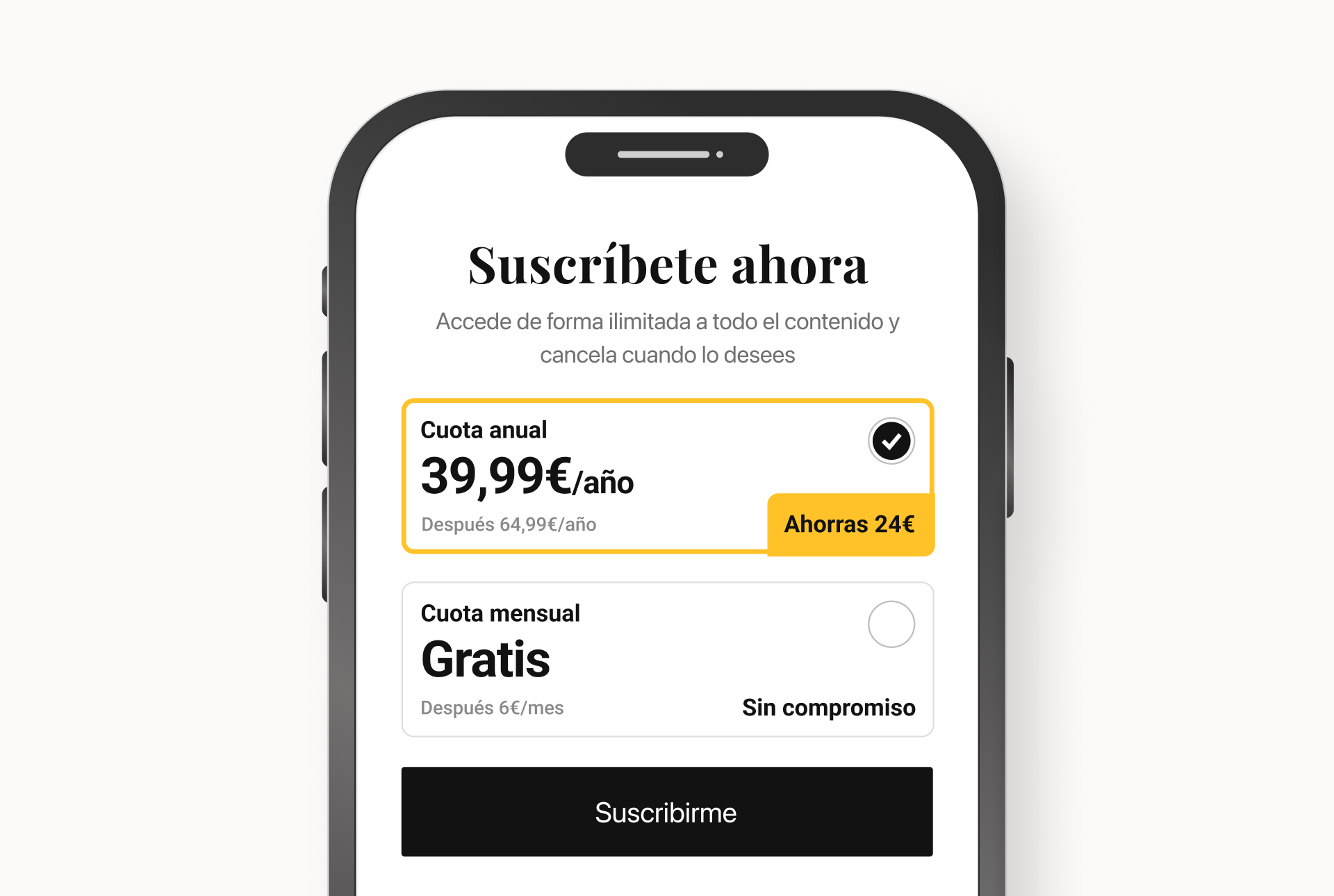
The Annual plan is pre‑selected with a visible savings badge. The Monthly plan stays one tap away — no friction, just a clear default. The decision benefits both sides: lower per‑month price for the user, higher LTV for the business. Validated two years later: on EC plans only, Annual wins 71.7% to 28.3% over Monthly. The default does its job.
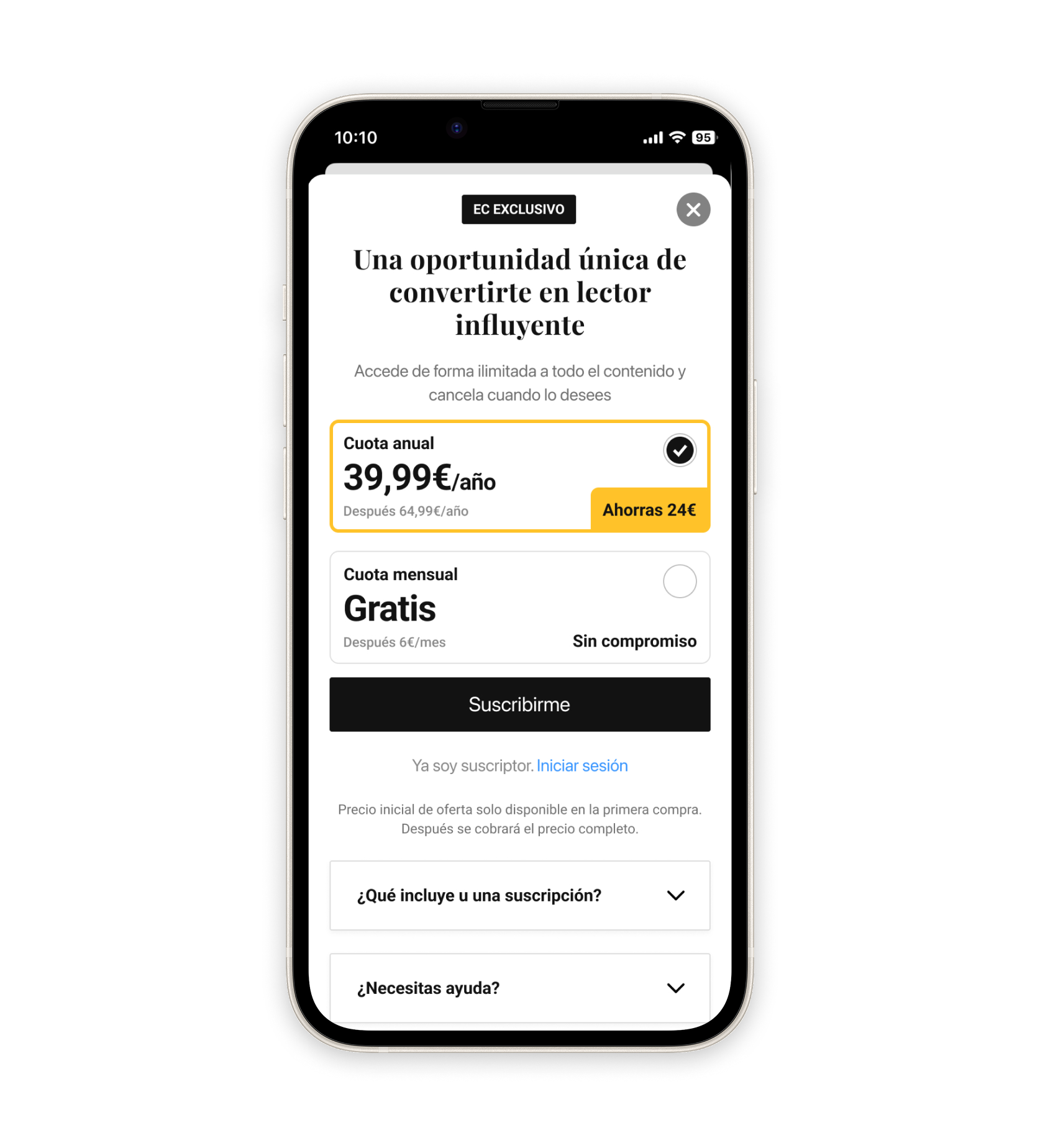
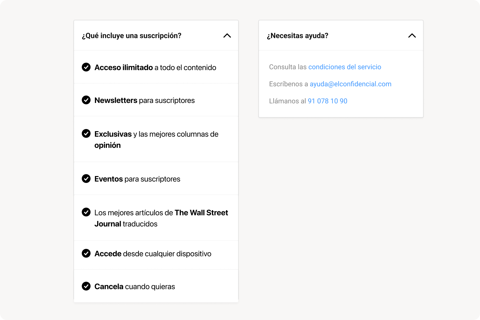
The user who reaches the landing has room to ask; the user stopped by a modal doesn't. Two expandable tabs — "What does a subscription include?" and "Need help?" — keep the screen clean for who wants to go straight, and add depth for who wants to think it through. The informational tab gets 60% more clicks than the support one — consistent with a moment of decision, not incident. And among the users who open it, 15.6% end up subscribing — about 9× the conversion of the landing as a whole. Whether the tab triggers the decision or just identifies users already close to it, the signal is the same: it's a high‑intent touchpoint, not decoration.
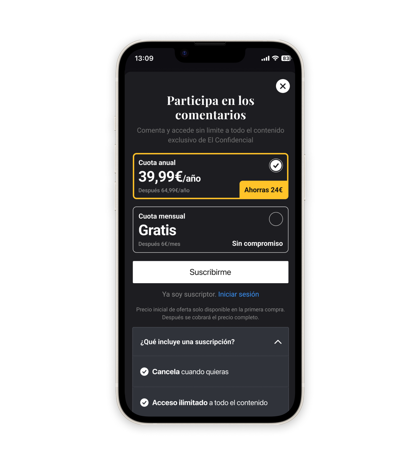
The whole El Confidencial app supports light and dark mode. The paywall, as part of the system, had to follow — pulling the same colour tokens, the same contrast rules, the same component styles defined elsewhere. Here it is in another flow, in dark mode: a non‑subscriber tries to comment on an article. Different entry point, same component, the right styles for the mode the user has chosen.
Numbers pulled from production across every flow where the paywall appears. Two years after launch, the component still carries traffic and the design decisions still hold up.
Five decisions that defined the redesign. The first one is the architectural one — everything else follows from it.
The component is still the paywall across all four flows. The decisions made back then — annual by default, expandable tabs, copy editable without a release — are what the numbers in production reflect today. The team kept iterating on top: new offers, refreshed copy, additional flows where subscription matters. The system absorbed it all without rework.
Four separate screens, one per flow, would have been faster in sprint 1. But by sprint 12, every change would have propagated by hand across four places, with drift guaranteed. One component, every flow — that's what makes a system survive years of iteration without rework.
The previous app paywall had been live with unreliable numbers for months — we couldn't compare plans or flows properly. Bringing the measurement decisions into the same sprint as design — instead of leaving them as a follow‑up — has been the most useful process change of the project, and the one I keep reusing on other cases since.
SUSC can iterate paywall copy without waiting for an app release. Data can compare conversions across triggers on the same table of events. Apps can open new entries without redesigning. The decision to "design as a component" is what lets three different teams move without waiting for the designer.