El Confidencial is one of Spain's strongest digital newspapers — 25 years publishing digital-only. That means 25 years of design decisions piling up in layers, with each team applying the brand their own way and nothing centralized. When the company committed to a full rebrand, we used it as a chance to fix that at the root: build the design system first, then migrate every important surface onto it.
The honest starting point was messy. Every team had handled the brand their own way for years — not carelessly, just because that's what happens when a product grows for 25 years with different people and no central agreement. Things were documented in Figma, but most weren't, and even when they were, production had diverged. A slow degradation between what had been designed and what was actually live. No shared library meant every new thing invented its own colors and sizes.
The rebrand gave us a window to fix that at the root. We built the design system first and migrated every important surface onto it. My scope: foundations, subscriptions, and the editorial layer.
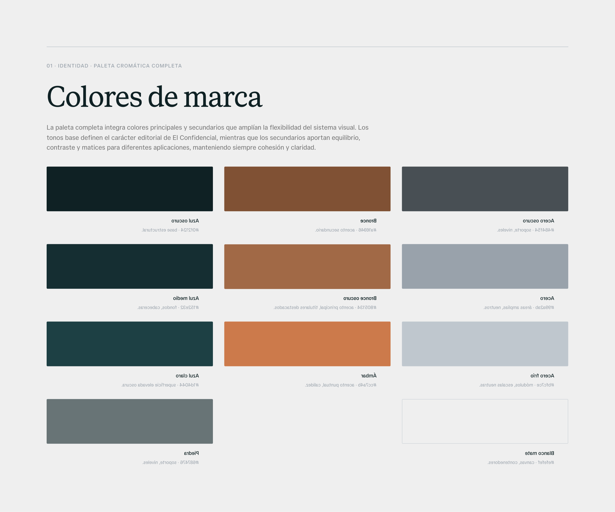
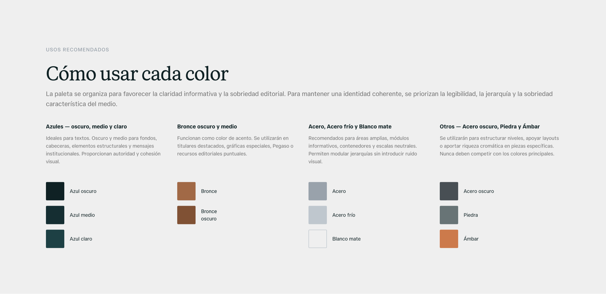
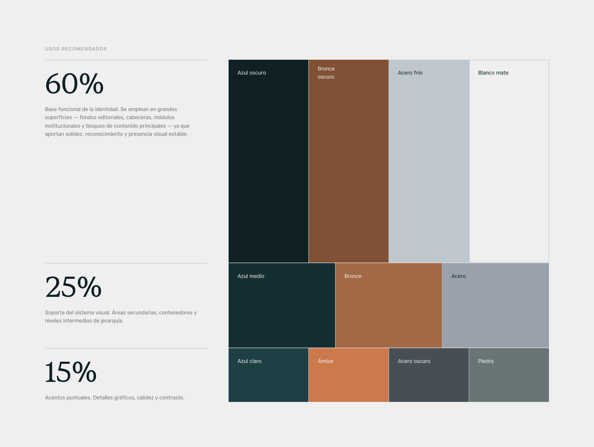
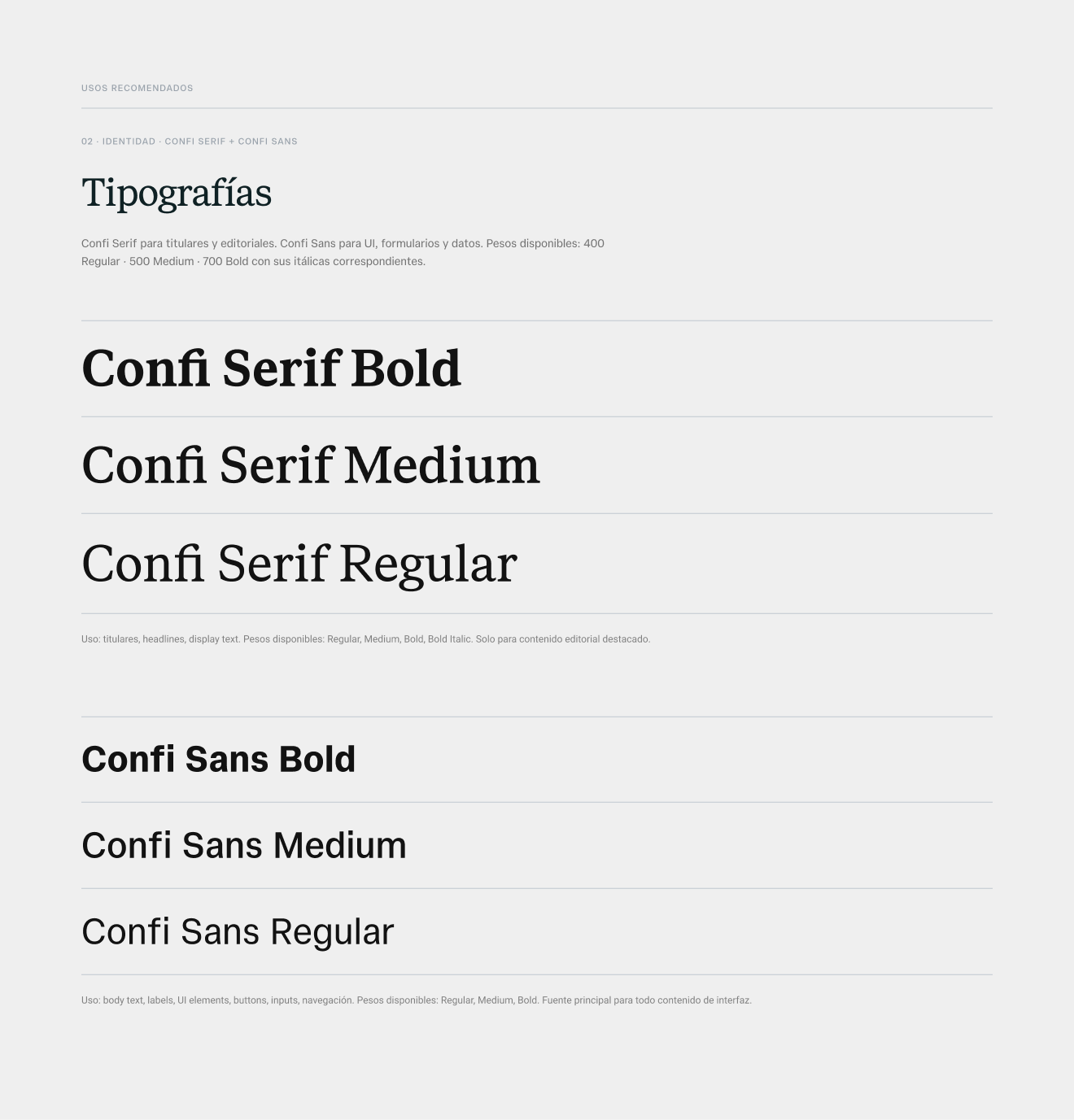
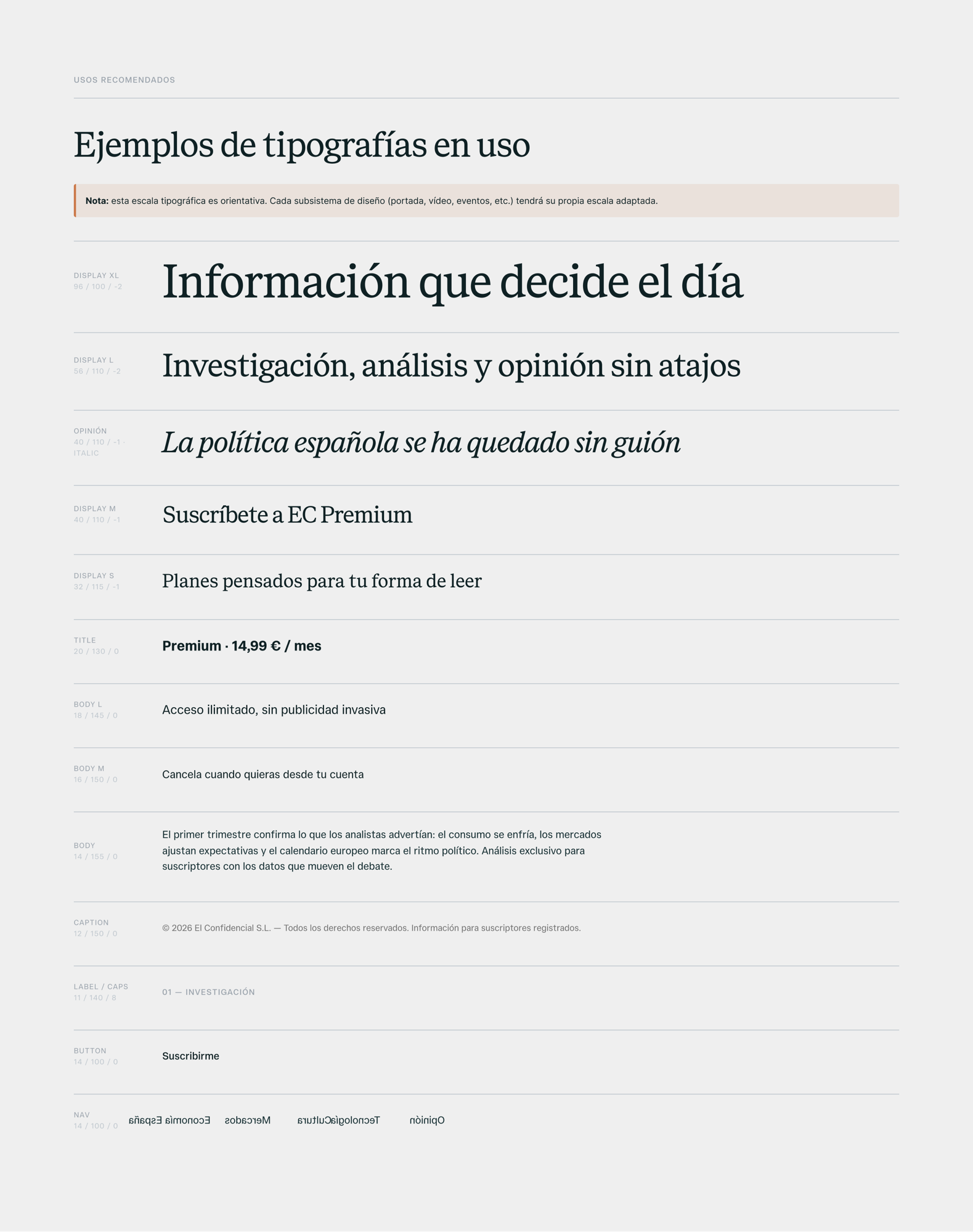
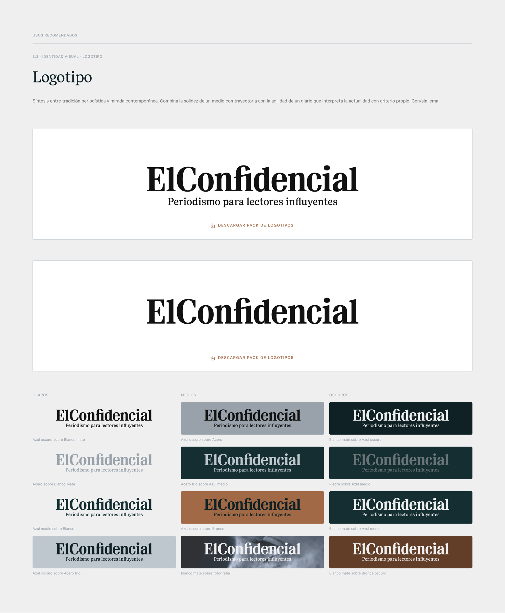
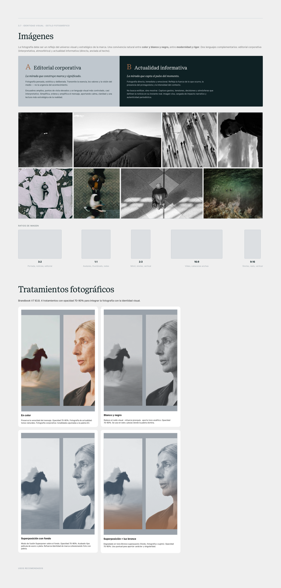
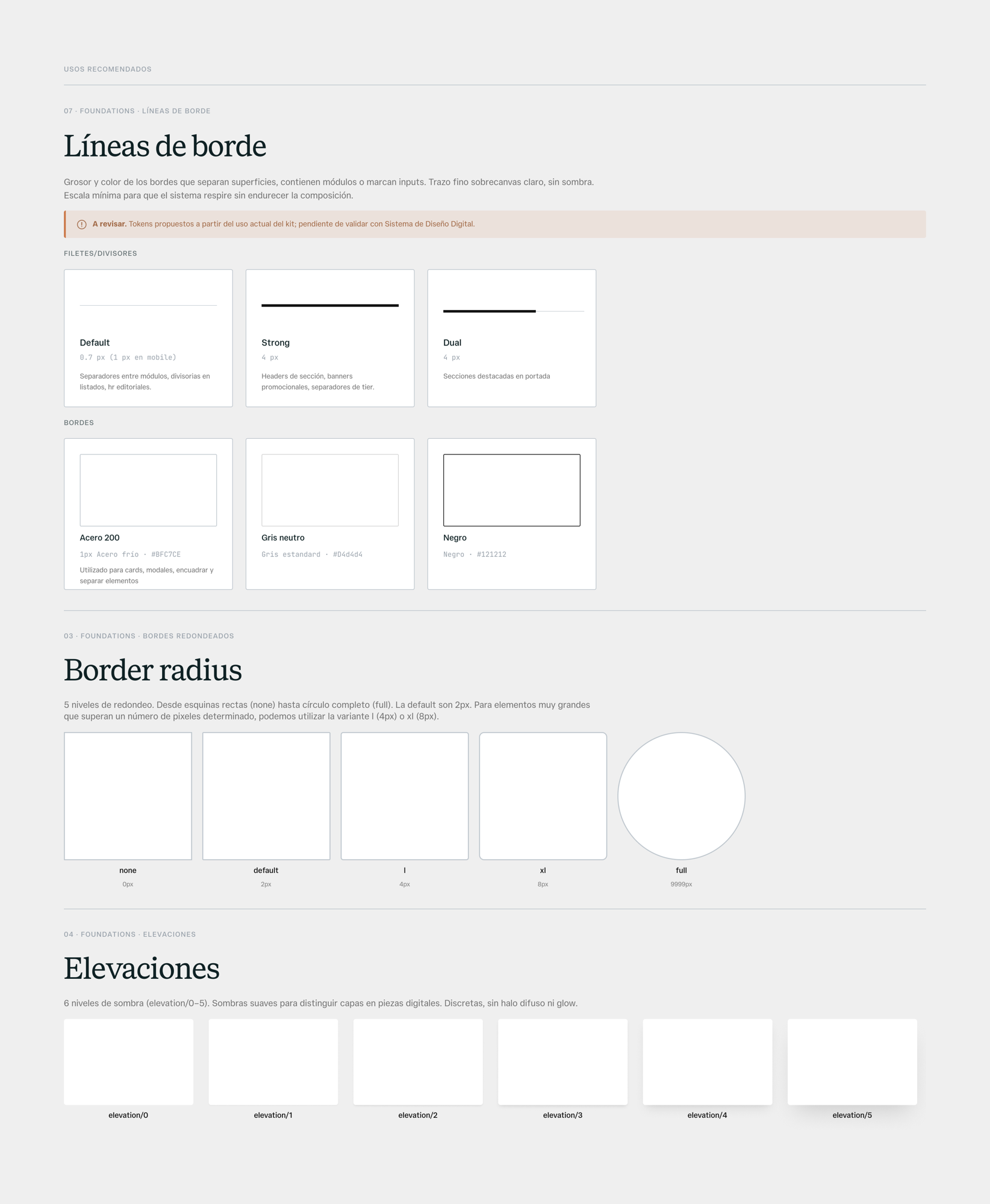
Foundations cover the entire company, not just the product team — every area builds from the same layer. We turned the new identity into a working system: the full palette with a written role for every color, the typographic scale across the two new families, corner radii, elevations, border rules, the icon set, breakpoints and the content grid. Plus the identity assets — the logo as a component set with all its variants, the brand symbol, photo treatments — and a final section showing everything applied to actual product surfaces: promo banners, subscription plans, pricing tiers.
The Figma library is the single file every team builds from — product, editorial, communications, corporate. With Claude Code integrated into the workflow, anyone can use and contribute to the system — always within a set of limits, guardrails, and approvals from the people who maintain the library. That opens it up in both directions: teams can design new product surfaces in Figma without starting from scratch, and anyone can spin up a working AI prototype directly from the same tokens and components.
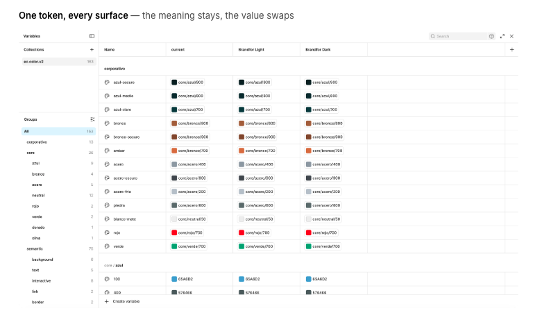
We built a token system with the goal of constraining the design space and creating a shared vocabulary between design and front-end. A closed set of named values means there's no open palette where anyone can invent a new shade. Every color, spacing step, or radius that gets a name becomes the only valid option for that role. That forces a conversation that usually never happens: what does this actually mean? Is this "primary text" or "subtle border"? Once you answer that, the name goes into the token and both design and front-end use the exact same word for the exact same thing — finally speaking the same language.
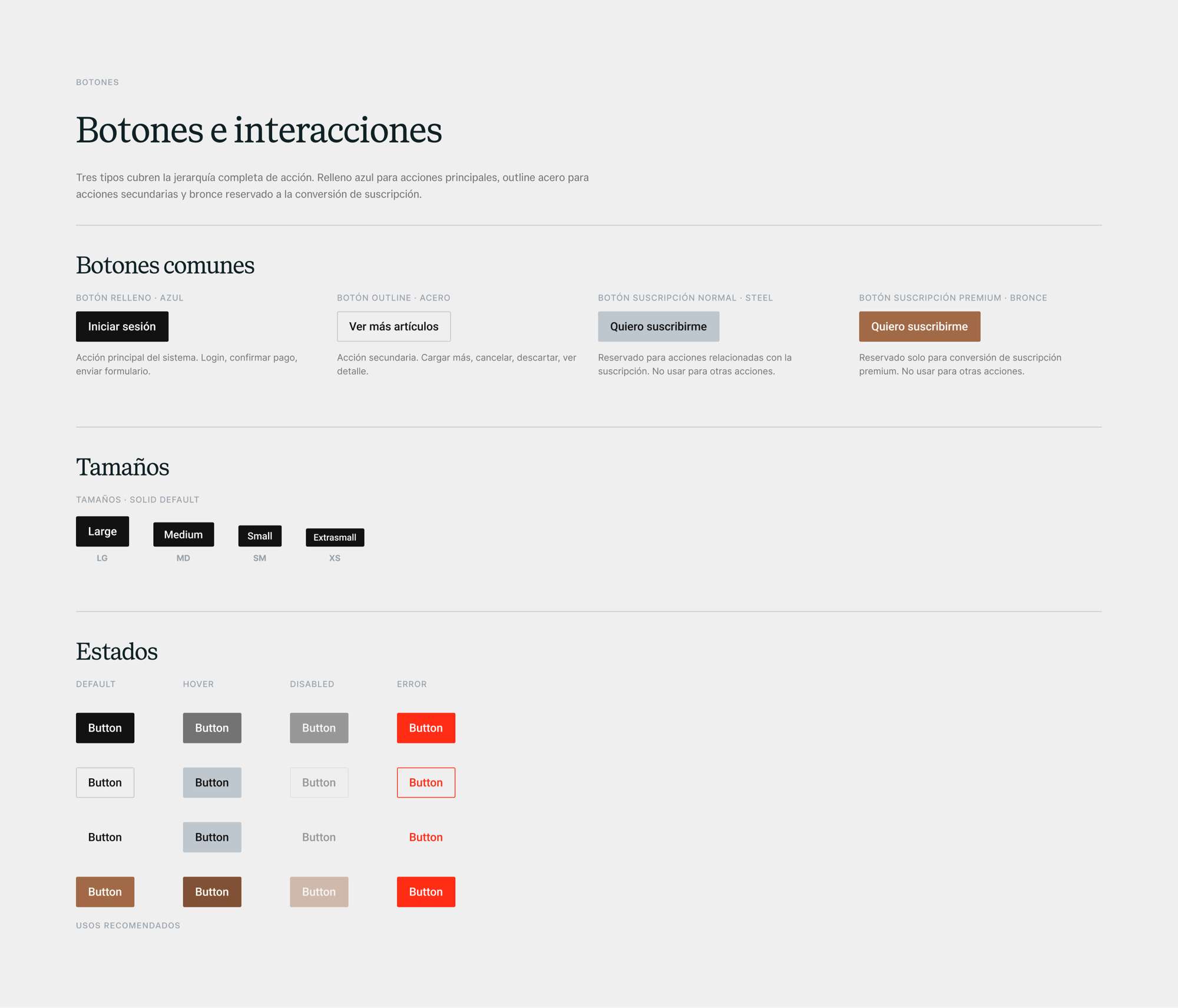
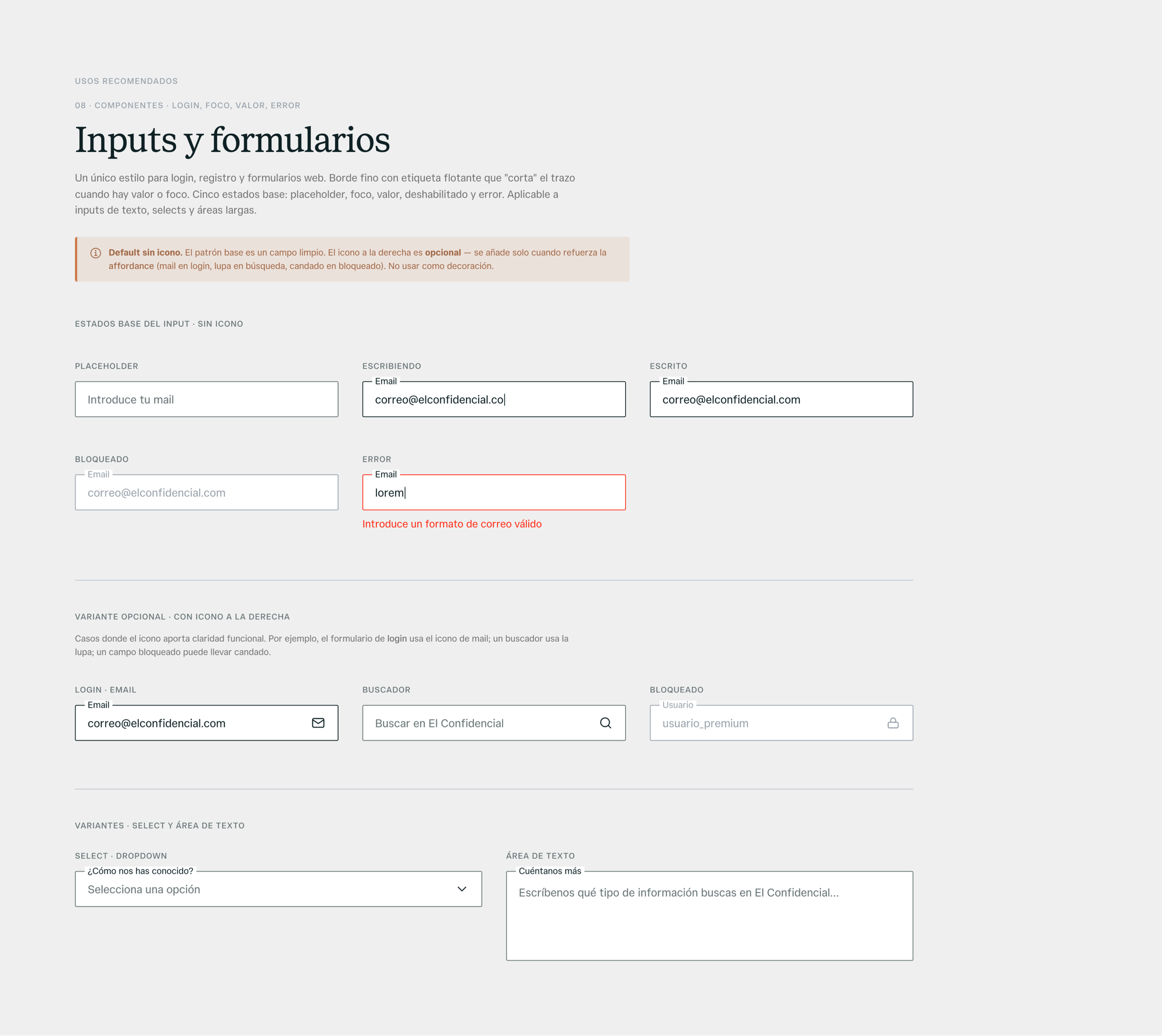
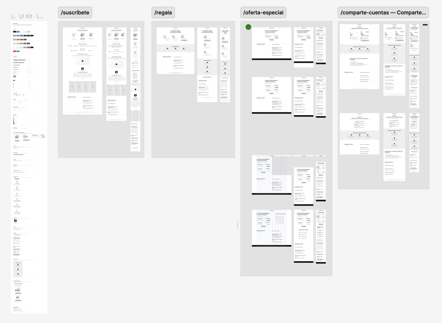
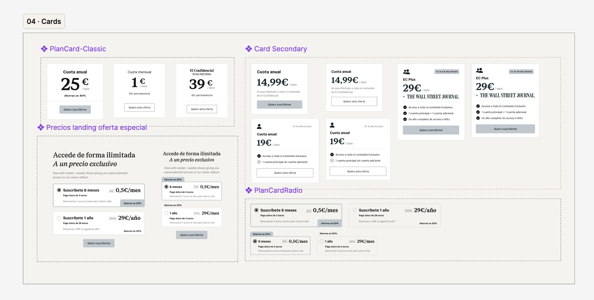
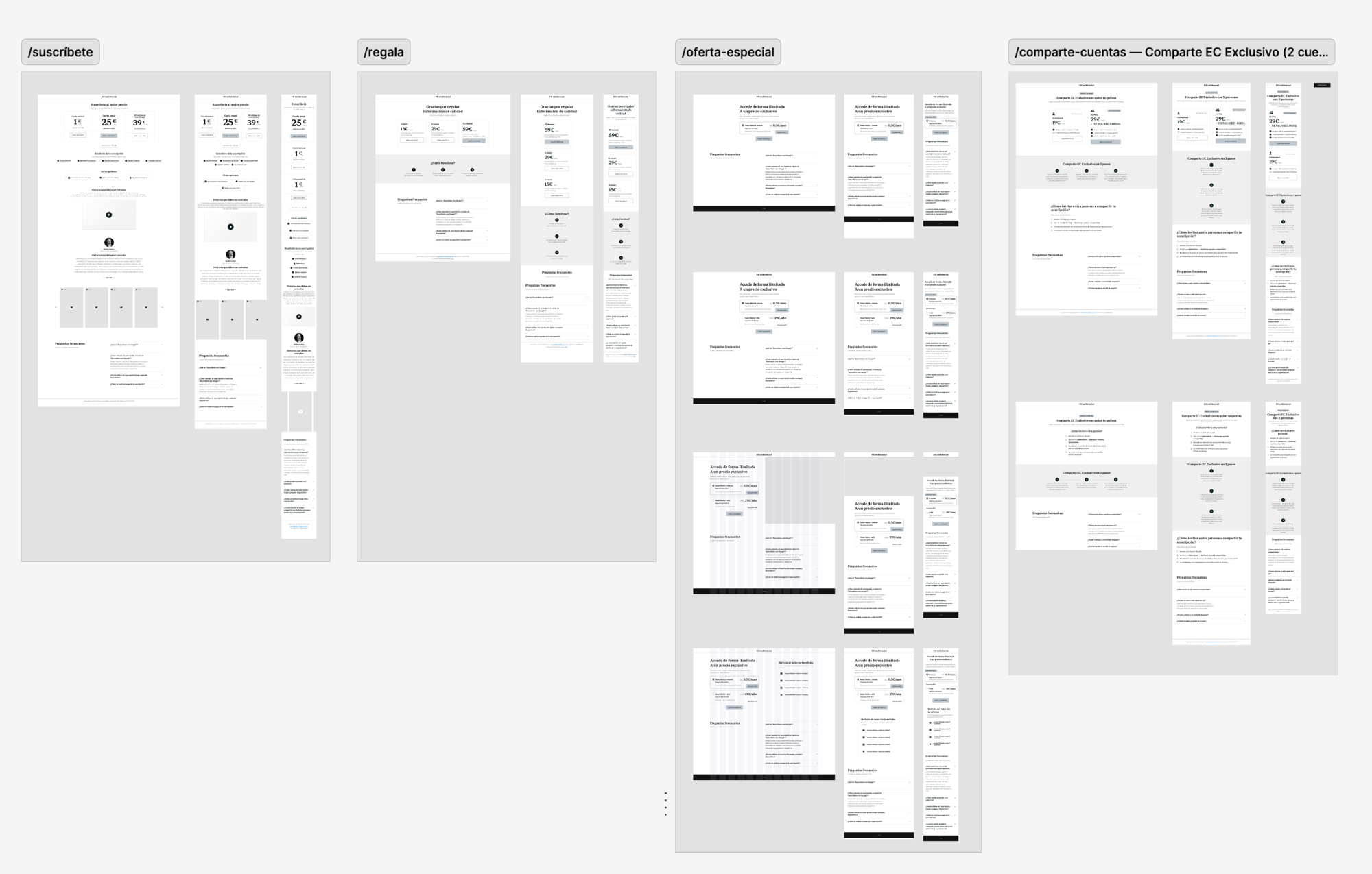
Subscriptions is one of my main areas of the product — that includes every kind of sales landing, inline paywalls, subscription modals, transactional flows, payment screens, plan comparison pages, winback campaigns…
Beyond the components themselves, we built a complete UI kit that lives inside the design system — a way to document and explain every component and every use case, so anyone working on this layer understands not just how to use a piece but why it exists and what it's for.
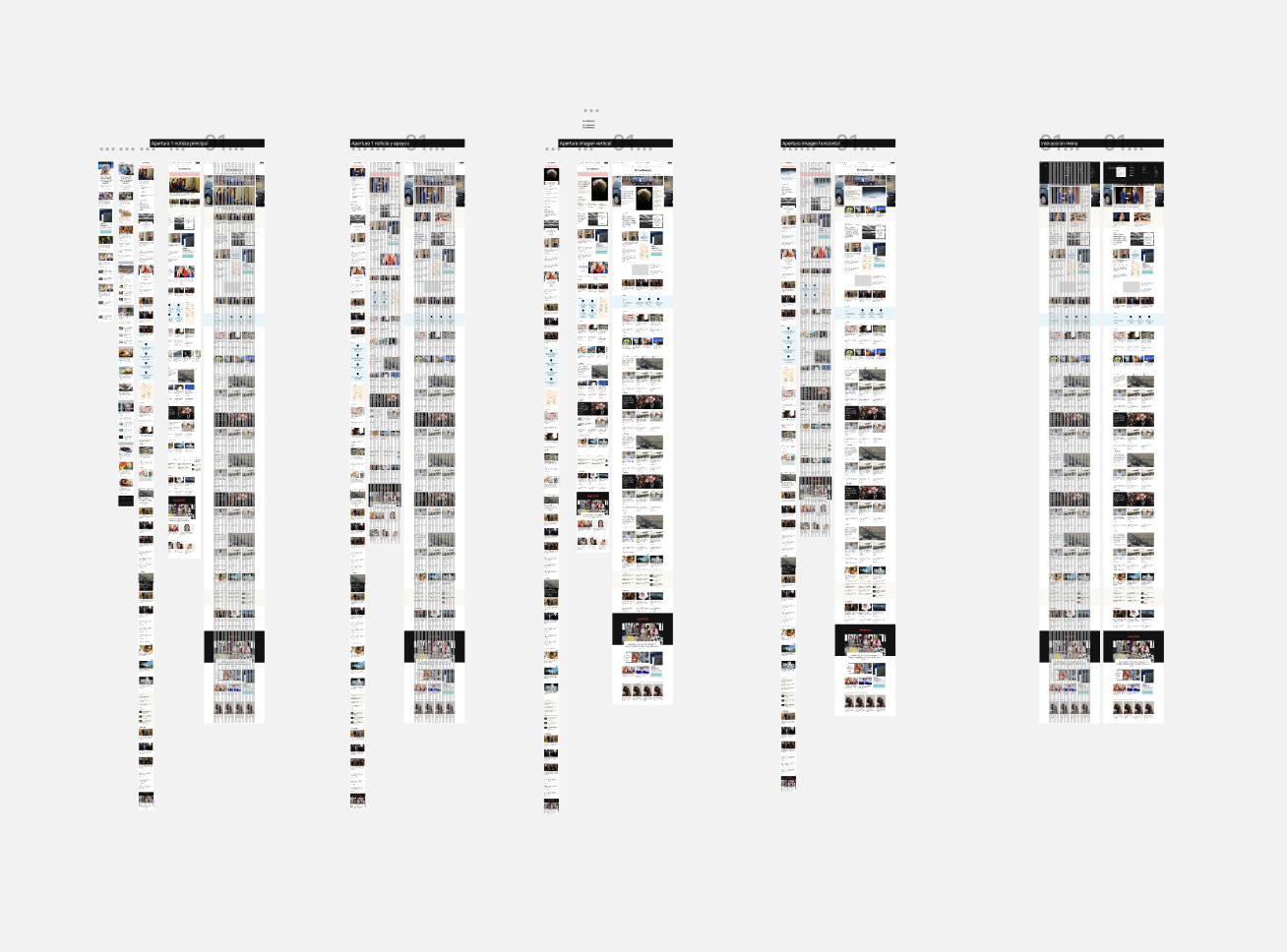
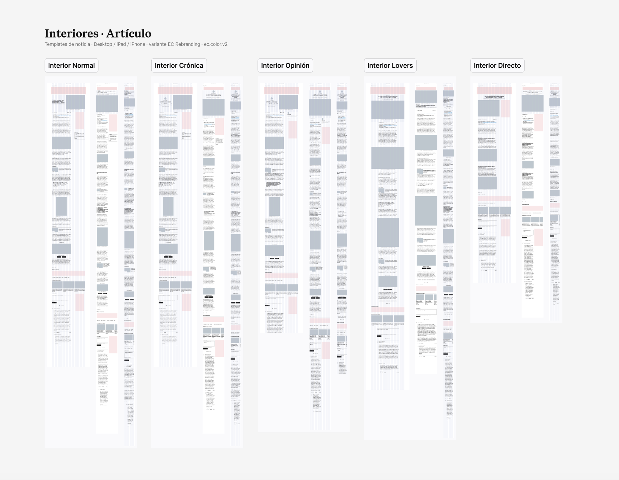
The editorial layer is the heart of the newspaper: article templates in five editorial formats (standard, chronicle, opinion, lifestyle, live coverage) across desktop, tablet and phone, plus section fronts, newsletter and podcast pages, and the component library behind them.
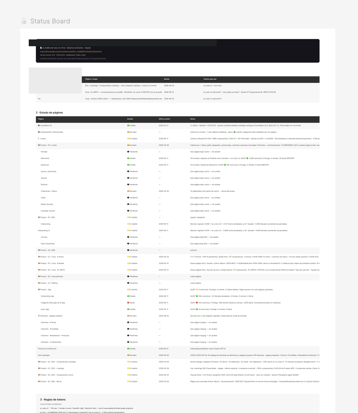
A design system shared by multiple designers fails quietly — everyone agrees on the rules and the file drifts anyway. We made the operation explicit: a status board inside the file, where you claim your scope before touching anything and a locked scope keeps you out. Every session closes with a dated changelog entry: what changed, what's pending, what broke. New contributors get an onboarding document, not a guided tour.
Part of the mechanical work — mass rebinds, per-node audits across thousands of paints — ran through AI agents working inside the file. The goal was to build a system that AI could operate, not just one that humans could use. The protocol makes that safe: an agent can't invent a color that doesn't exist in the canonical collection, a scope lock stops it from touching another designer's work, and a dated changelog makes every automated session auditable. We didn't adapt the workflow for AI — we built a workflow that anything could follow.
The other payoff shows up in daily work. Anyone on the team can now design in Figma on top of a solid base — clear guidelines, defined patterns, no starting from scratch. The decisions are already made; you just build on them.
The first proof came sooner than expected: during an internal hackathon, a team prototyped a brand-new games section — landing, game pages, cards — and built the whole thing on the system in days. The palette, the type, the borders, the spacing were all decided before anyone opened a blank file. That's the system doing its job: the next product idea starts from the brand, not from zero.
A component so complex that nobody knows how to use it isn't a component — it's a liability. Sometimes the right call is a set of simple, well-named pieces that everyone on the team can actually pick up and use, instead of one architecture that only the person who built it understands.
When the brand lived in a PDF, every team applied it differently — not carelessly, just without a shared constraint. Once every color had a written role inside a collection everyone consumed, the interpretation gap closed on its own.
"Everything consumes one collection" is something a script can check. "Be consistent" is something nobody can check.
A status board, a dated changelog and an entry ritual kept four people (and their tools) from quietly destroying each other's work.
On a 25-year product running multiple frameworks, some surfaces are technically out of reach — rendered by third-party tools that don't share the same CSS. When you have a deadline, you need to know how far you can actually go and document the limit clearly, rather than treating it as failure. A system that's honest about its boundaries is much easier to maintain than one that pretends it covers everything.