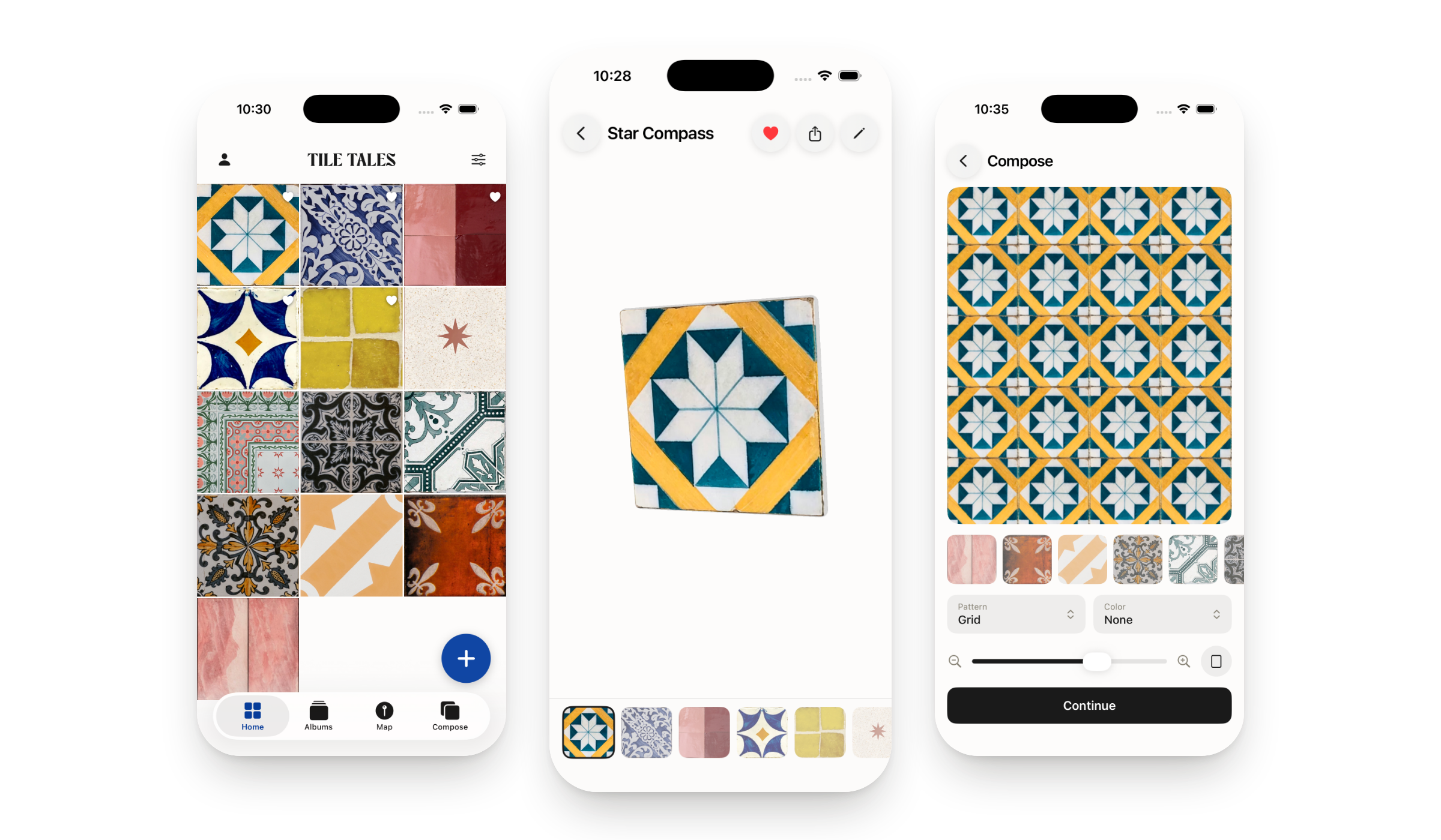
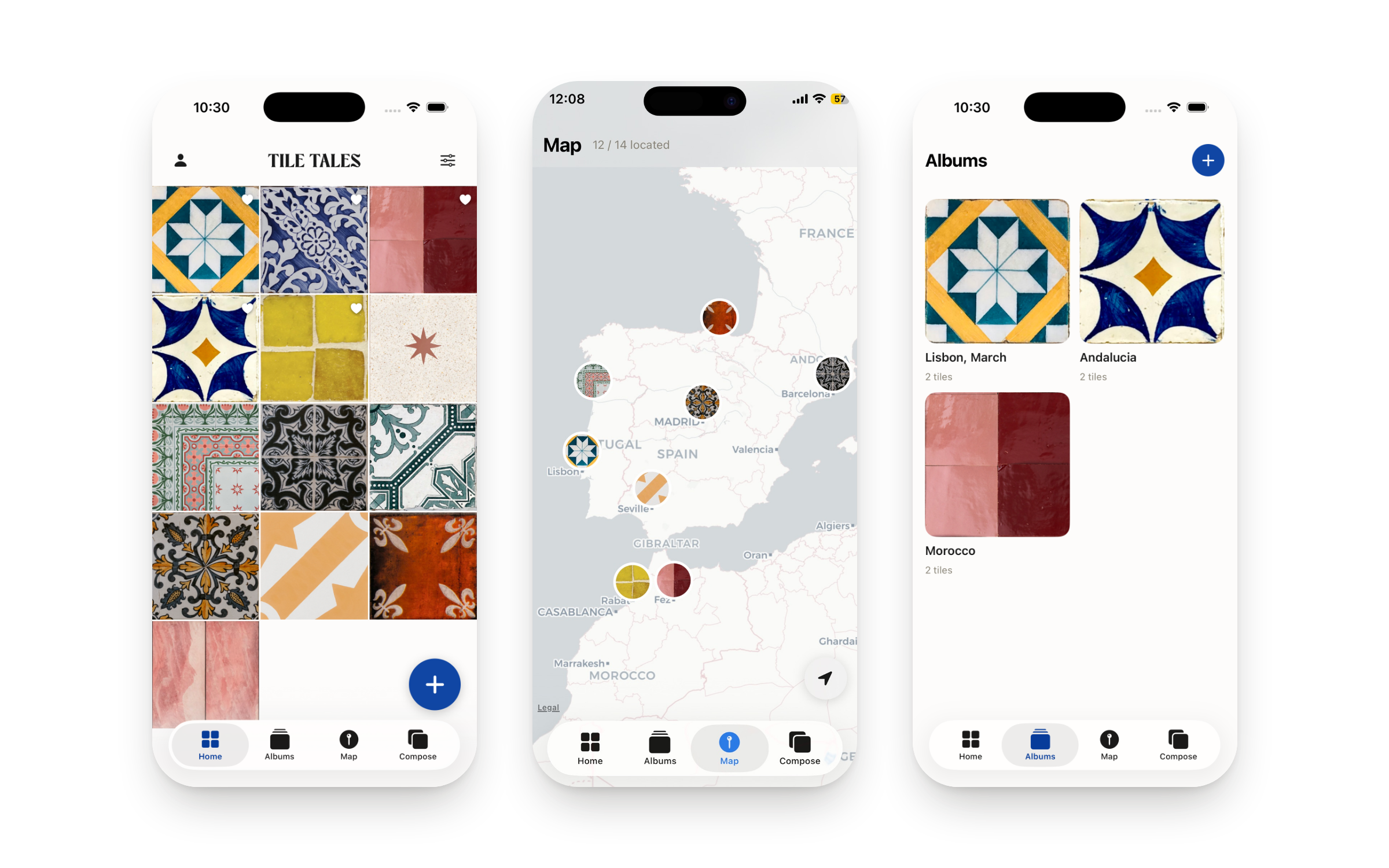
Tile Tales is an iOS app for collecting the street tiles you walk past. You photograph one, crop it square, and it becomes a ceramic object you can pick up, turn over and write a memory on the back of. It pins itself on a map from the photo's GPS, and you can tile it into a repeating pattern and keep it as a wallpaper. I designed and built the whole thing on my own and shipped it to the App Store.
Eight years of product design, and every screen I had ever made was finished by somebody else. Engineering built it, the company shipped it, and the part I owned stopped at the handoff. I wanted one project with nobody downstream of me.
Shipping was the whole point. A prototype proves an idea looks nice in a folder. A listing on the App Store proves the thing works for someone who is not me, on a phone I have never touched, under rules I do not control. So the finish line was Apple's review queue.
Every city is covered in tiles nobody records. Lisbon's calçada, Sevilla's azulejos, a Delft façade in Amsterdam. People already photograph them, and the photo then dies in a camera roll with ten thousand others.
Tile Tales gives that photo four things a camera roll never will: an object, a memory, a place, and a use. The tile gets thickness and edges. The back holds a handwritten note. The map reads the GPS out of the original photo. And Compose tiles it into a pattern you can keep as a wallpaper. The whole app is one gesture — the photo you were already taking — followed by the four things worth doing with it.
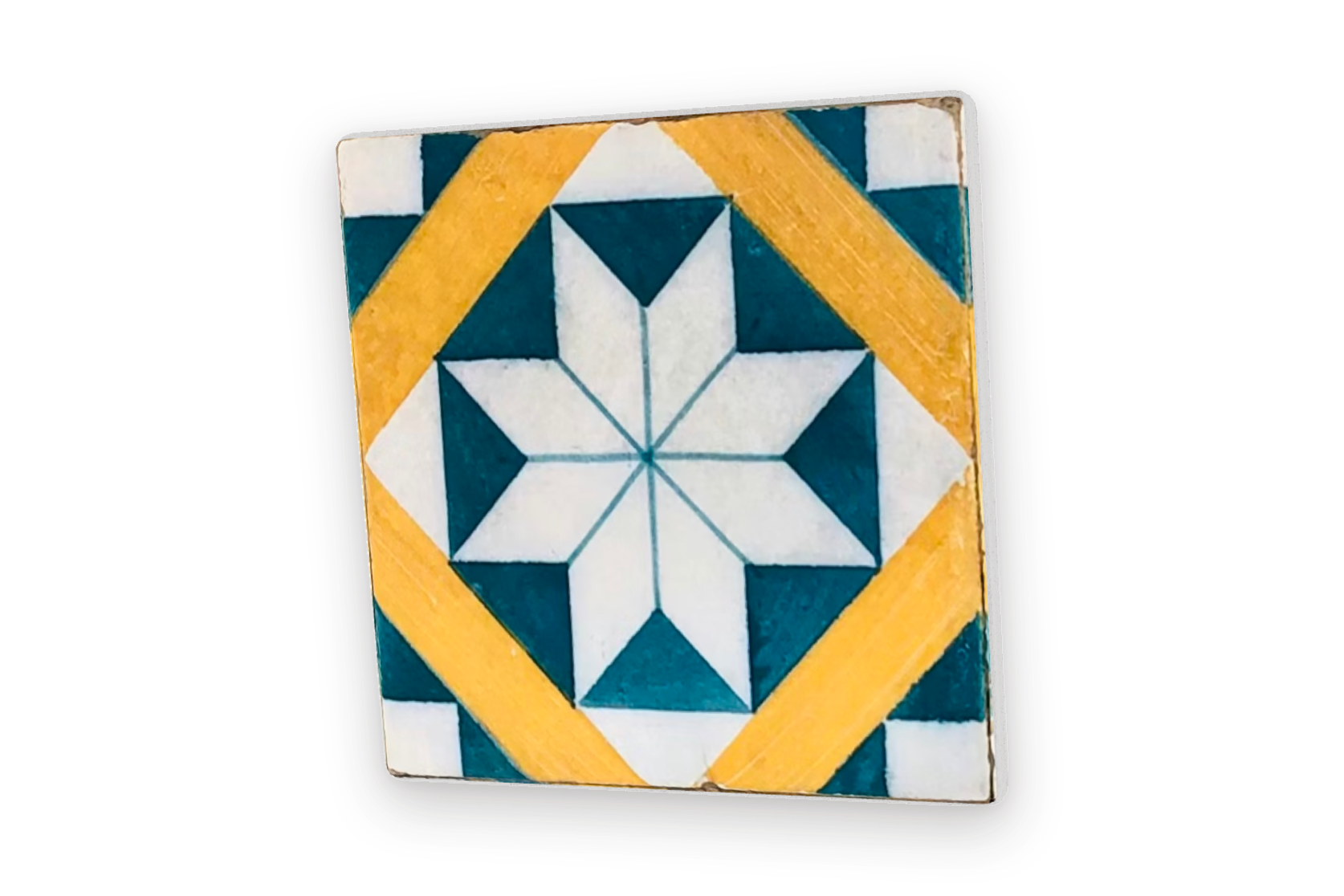
A photograph of a tile is flat, and flat is the one thing a tile is not. The one that stays in your memory has a chipped corner, a glaze that catches the light, and four centimetres of fired clay behind it.
So the tile in the viewer is a real object: a single box with chamfered edges and unlit shading, so the light never blows out the photograph the way a lit material does. It drops into frame from above, unwinding half a turn on two axes so it always lands facing you, and it keeps breathing gently while it rests. Turn it and you see the ceramic thickness on the edge.
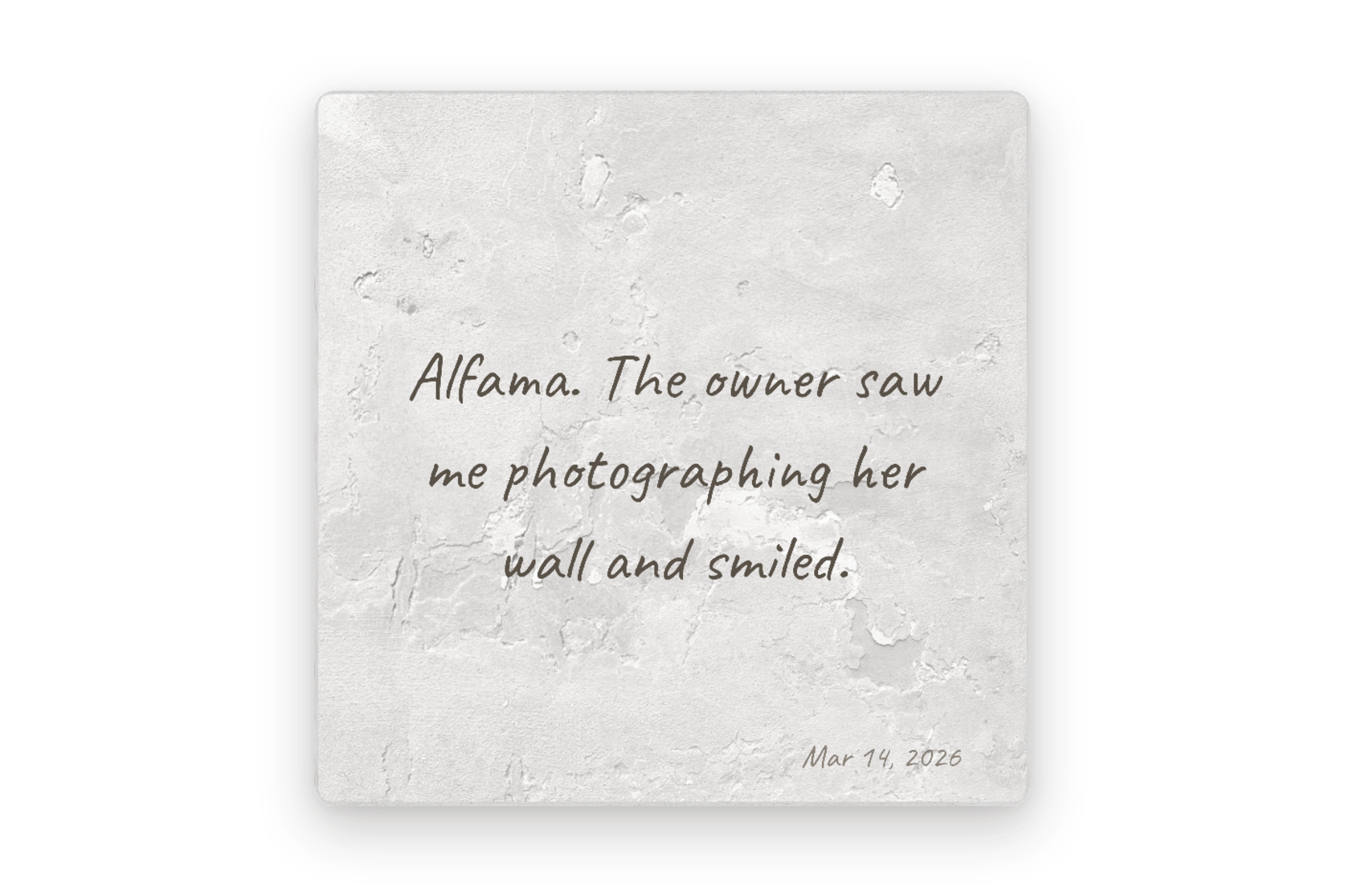
The back of the tile is where the note lives, in handwriting, on a rough ceramic surface, with the date in the corner.
Putting it on the reverse rather than under the image is the whole reason the object is 3D: you have to turn the tile over to read it, which is exactly what you do with a real keepsake.
The first version let you swipe sideways between tiles. It also let you drag to rotate the tile. Both gestures wanted the same drag, so the app was permanently guessing which one you meant, and it guessed wrong most of the time.
I removed the swipe. Every drag now rotates, and you change tile from the strip at the bottom, which highlights the active one and scrolls it into view. Giving up a shortcut bought back the one interaction the entire app is built on.
A single tile is a keepsake. Repeated, it becomes what tiles are actually for. Compose takes any tile from the collection and lays it out as a real pattern — grid, mirror, diamond, pinwheel, or a field with an accent tile. The same photograph gives a completely different result depending on which one it lands in, so the choice is the design.
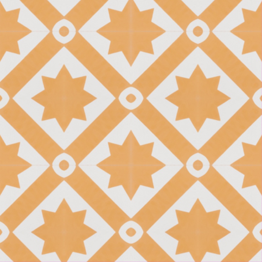
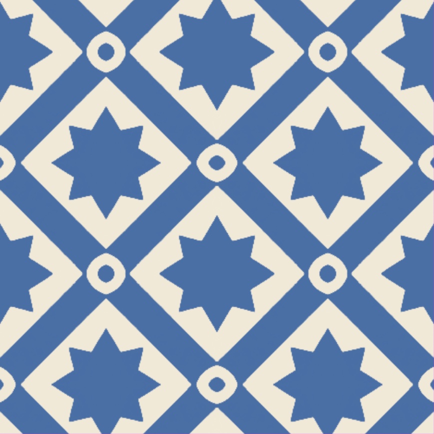
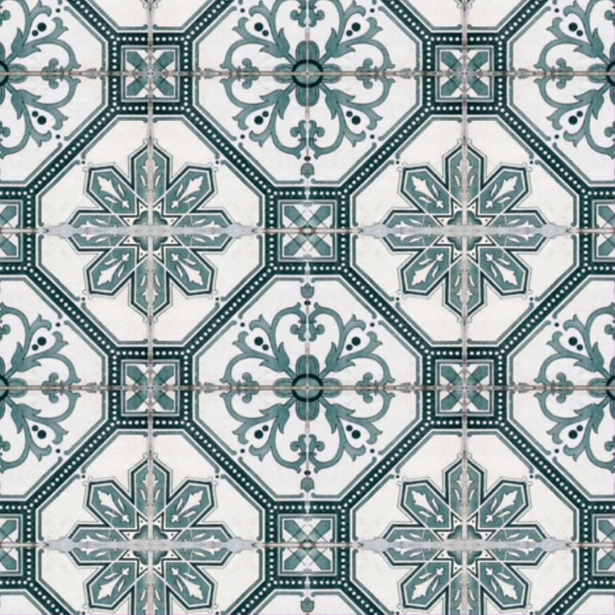
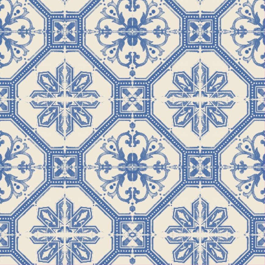
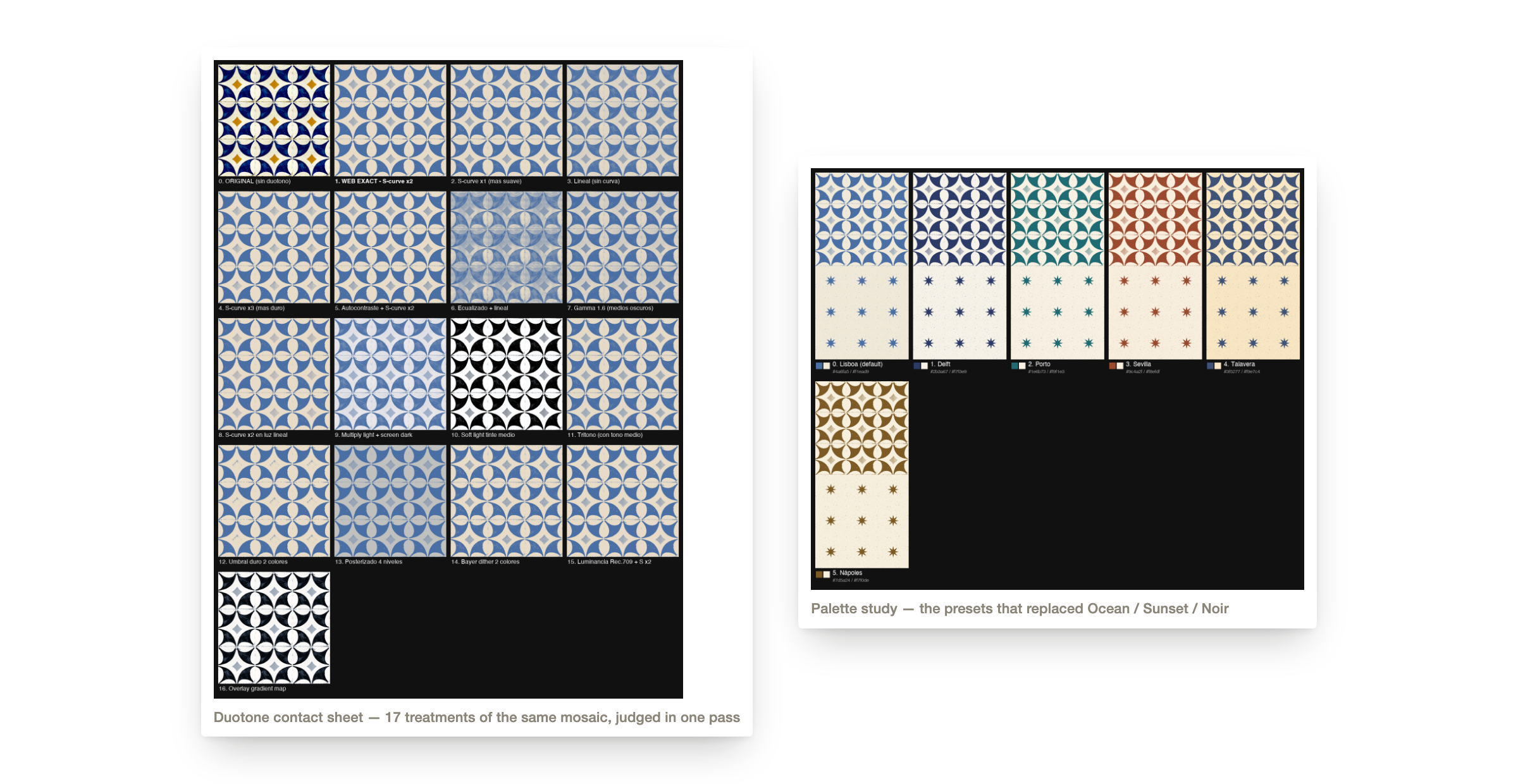
The size control moves in whole columns rather than free pixels, so every step adds or removes a complete tile and the preview always matches the exported wallpaper. A duotone pass then reduces any tile to two colours: Lisboa is the preset that came out of the contact sheet above.
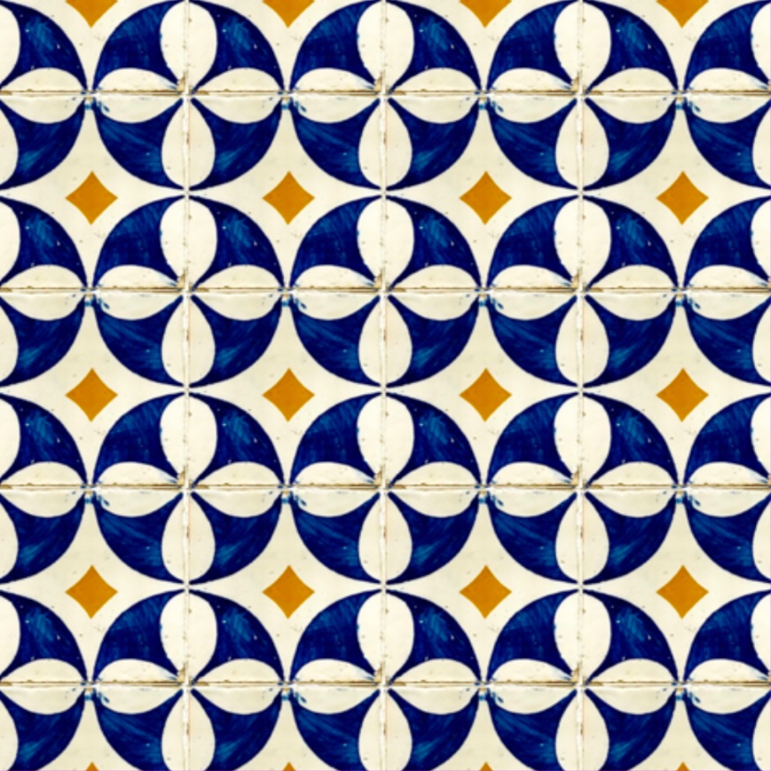
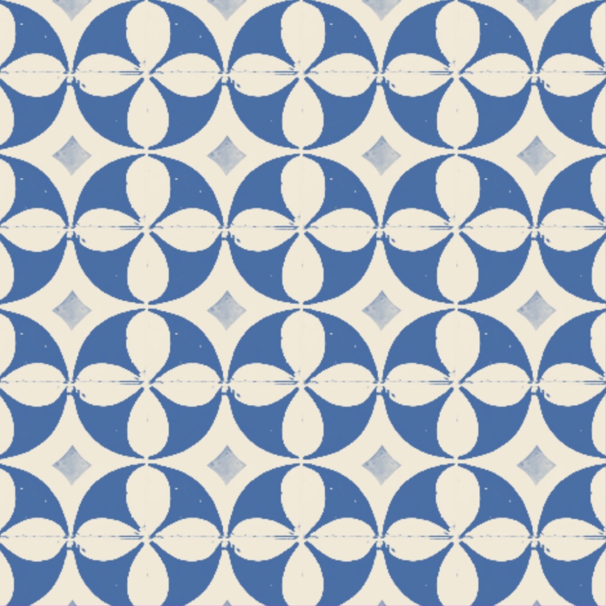
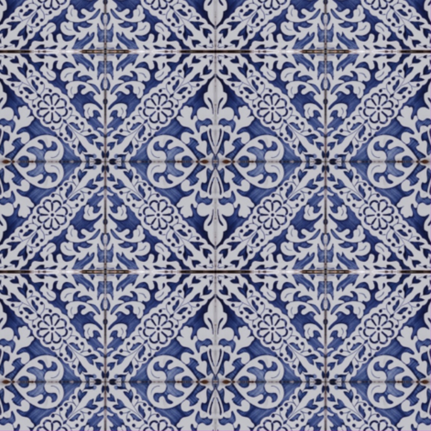
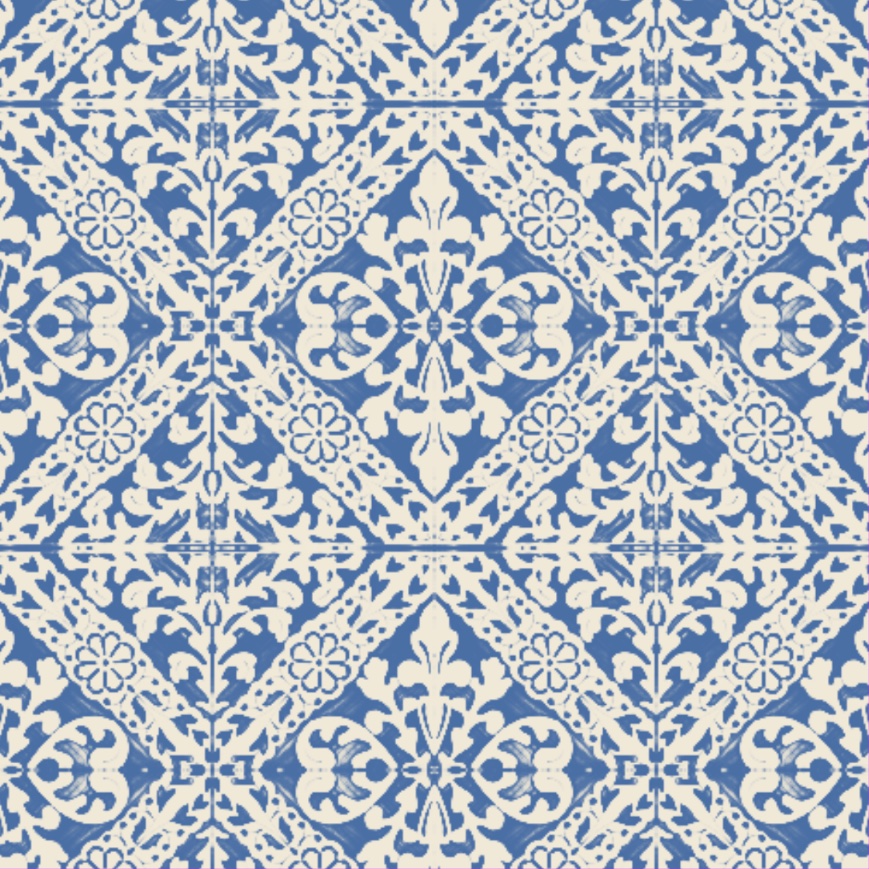
Pick a tile
Two decisions could not be judged from a spec: the duotone filter, and which patterns Compose should offer. Both are the kind of thing you only know when you see a dozen of them next to each other.
So instead of compiling a build per variant, I wrote small scripts that render contact sheets, and chose from the sheet in a single pass. The duotone that won auto-contrasts each image before the curve, because the version I had ported from the web washed out every pale tile. Diamond became the grid rotated 45°, Brick came out, and Accent went in.
The reason a personal project never reaches the store is that it never stops growing. Five decisions kept this one finite.
The reason a solo designer can now finish something like this is that the gap between deciding and seeing has mostly closed. I worked with Claude Code as the build loop: I made the product and interaction decisions, described them, and had a running version on the phone in the same sitting.
Three things changed about how I design because of it. Exploration became visual rather than verbal — the contact sheets above exist because generating a whole sheet of variants stopped being expensive. The prototype is the product, so a decision that survives a session is shipped, not specified. And I had to learn the platform's grammar, not just its look: a dropdown I built for "add to album" was correct on the web and wrong on iOS, where the answer is a centred modal. Working this way does not let you skip knowing the platform. It stops the handoff from being where ideas go to die.
The last stretch is the part nobody shows: an icon at every size, a store listing, a privacy policy that has to live at a public URL, an age rating, a trader declaration, and a build number that has to be right.
The icon and the five store screenshots were the most familiar work in the whole project, and the only part that looked like my day job.
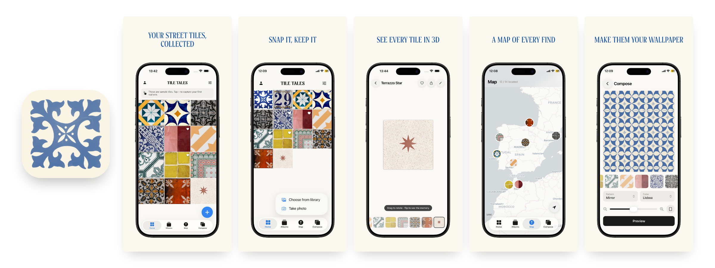
The app collects nothing about the people who use it, so there are no adoption numbers in this case. What there is instead is a public listing and the facts of getting it there.
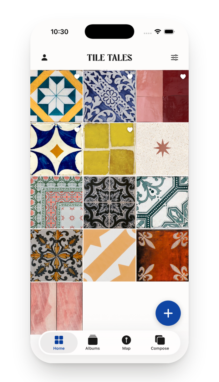
Tile Tales
A little museum for the floor and walls under your feet.

Free · iPhone · iOS 18 or later · No data collected
Days after it went live I watched one person who is not me use it for five minutes. They found six frictions I could no longer see.
The worst one looked like a bug and was really a perception problem. Creating a tile appeared to do nothing, and a saved wallpaper took seconds to show up. The app was encoding the entire collection — every captured photo, in one blob — on the main thread every time anything changed, so the interface froze for about a second and the screen simply did not update. The fix was to snapshot on the main thread and write in the background. No spinner, no progress bar. Sometimes the honest fix for a design problem is architectural.
The same session produced the rest of v1.1: a tags field that was being saved but never rendered, a "Save to Photos" that reported success even when permission had been denied, a Stats screen showing a confident zero while it was still geocoding, and two buttons renamed to "Save in app" and "Save to Photos" because a tester went looking for their wallpaper in the wrong place.
The design work was the part I already knew. What I did not know was provisioning, review guidelines, privacy declarations and the small print of a store listing. That stretch is where personal projects quietly die, and getting through it once changed what I consider finished.
Dark mode, the guided tour, the feed and accounts were all real work, and three of them were already built. Removing them is the only reason there is a listing to link to. A scope decision you make after building the thing costs more and teaches more.
Seventeen duotone treatments took minutes to produce. Choosing one still took taste and a reason. The work moved from making the options to being able to say why one of them is right.
Six frictions, and I had used the app every day. Launch is where the feedback starts.